In the interest of not taking up too much space on the main page, my final on data visualization will be under a “Read More”
Dataset
The dataset I’ve chosen to work with is the Albany Muster Rolls 8th Militia dataset. It is a census of enlisted men out of Albany, New York, for the Revolutionary War. There are a total of 944 men listed in this dataset, with 13 attributes or descriptive categories filled out. These categories include last name, first name, enlistment date, age, where the recruit was born, what their previous occupation was, what company they were part of, whose command they were under, their physical attributes, and what volume and page their information could be found on in the physical text. It is both a numerical and textual dataset, since the data listed comes in both word form, as with the names and place of birth, and in number, such as with the ages and birthdays. Each row of the dataset is one man, and each column is the different attributes pertaining to that one man. It should be noted, however, that not every attribute is filled out for every person.
Despite this array of information, some details are still life ambiguous. For example, it is difficult to see familial relationships, if any exist, between the recruits, meaning that analysts won’t necessarily be able to use this dataset to see if relatives enlisted together. The dataset does give a comprehensive range of information in other forms, however. From the dataset we can see that the youngest recruit was 16 years old and the oldest was in his late 50s. The enlistment dates all fall between 1760 and 1762. The place of birth column has a vast array of different places, though it should be noted that the majority of enlisted men seem to be from either Ireland or Germany. Some of the men are from other countries or territories such as Barbados, England, Holland, and Guinea. Many of the men are documented as being born in the United States, in cities such as Albany, Martha’s Vineyard, and areas in the United States such as Long Island and Connecticut.
The physical description of each person is given in the form of complexion, eye color, hair color, and height. With some variation that might be due to typos or old terminology, the complexion category is filled with descriptions ranging across black, brown, dark, fair, freckled, “Indian,” “Mulatto,” “Negro,” pale, “pockpitted,” ruddy, sandy, and swarthy. Descriptions of hair color fall across “bald”, shades of brown, black, “fair”, grey, shades of blond, and red. Eye color also ranges across typical eye colors such as black, blue, brown and grey. One of the men is written as being blind. Since stature is listed as one of the attributes in the dataset, we know that the tallest man was 6 feet 2 ½ inches tall, and the shortest man was 4 foot 11 inches.
Lastly, the dataset details each enlisted man’s company and commanding officer. The dataset tells us that the 8th Albany Militia had 28 commanding officers within it. The amount of different companies is more difficult to decipher, though a count tentatively places it over 55. At least one man is listed as being a deserter. Unlike the commanding officer names, which seem strictly uniform and correct in spelling, the company names are more numerous and seem to contain spelling mistakes, which makes understanding the note takers’ intentions difficult. For example, the names “Groat,” “Groate,” “Grote,” and “Grott” seem like variations of the same name, but the commanding officers of the listed companies are not uniform.
The data provided in the Albany 8th Militia census can be used to make many assumptions. Before the data is looked at further, however, it might be useful to point out that examining data gathered from censuses, especially a seemingly non-standardized census, should be viewed through two different lenses: the very superficial, and what is implied by the data on a larger scale.
Figure 1
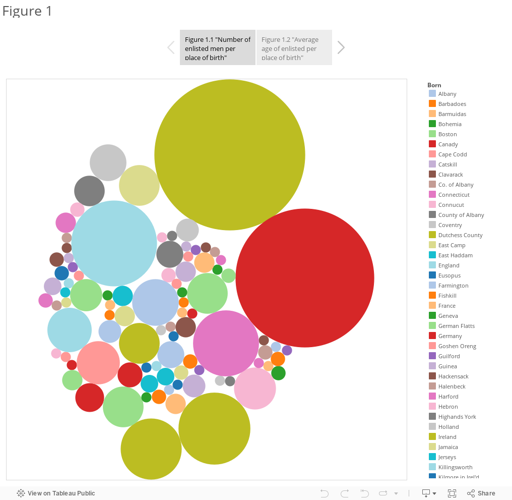
On a very superficial level, the visuals created using the dataset and presented in Figure 1 show the places of birth for all of the enlisted men who had their places of birth notated. It is obvious by looking at the first graph in Figure 1, Figure 1.1, that the place of origin with the highest rate of enlisted men in the militia was Ireland with 220 enlisted men. Following close behind is clearly Germany, with 186, and then England at 71. One can observe this by seeing the relative size of the circles next to each other, and by hovering over the circles with a computer mouse or by matching the color-coded key to the colors of the circles. Keeping the analyzation to a superficial view implies that either there were more Irish and German immigrants who cared to join up with the military, or that there were simply more Irish and German immigrants in the area at the time of enlistment.
Both of these cases might very well be true, but assuming that these are the only possible explanations behind the seemingly disproportionately high numbers of Irish and German immigrants in the census means that one is ignoring the many variables that might have gone into this ratio, as well as the greater historical context of this time. If one takes a closer look at Figure 1.1, it is clear that that the two largest circles represent places of origin outside what we would know as modern day United States of America. Many of the smaller circles, however, name regions or cities that are either in the United States or were at some time territories of the United States. If one adds the number of men who were born someplace within the United States, it is not unreasonable to assume that the count of men might be more comparable to that of Ireland or Germany.
Figure 1.2 shows the average age of all the enlisted men who are from all listed places of origin. The higher the bar and the darker the color, the higher the age average is. For example, though the oldest enlisted men in the dataset were 58 years old, the highest average age in the dataset is 46, and was born in Martha’s Vineyard. The youngest average age of an enlisted man is 16, which is reflected in a place like Lime Town.
At first glance, Figure 1.2 can also lead a viewer to false or misguided conclusions. Without reading the graph it might be assumed that a large quantity of older men enlisted in Highlands New York, for example, because that location is noted as having a particularly high age average. If one returns to Figure 1.1, however, and looks at the count of men who originate from Highlands New York, one can see that the age average is so high because there is only one man listed as being from that area. Places with less polarizing average ages are those listed as having high numbers of enlisted men, such as Ireland with 220 enlisted men and an average age of 31.
The initial plan to create Figure 1 was to use the program Gephi to creature more interesting and visually pleasing graphics. I had intended to input the values I am comparing in Figure 1 into the program to make networking graphs that would, in theory, show me clusters of where the highest concentration of enlisted men originated from, or cluster by age groups. Unfortunately, I was unable to manipulate Gephi into giving any clear indication of origin or age groupings, so I instead turned to Tableau Public.
Using the Google Chrome extension OpenRefine, I first uploaded the dataset and began cleaning up the given census. This was an important step because of the occasional misspelling of words or place names within the dataset would make grouping difficult and confusing. Unfortunately this was also an often frustrating step since it is difficult to tell whether or not some place names had been misspelled by the census takers. For example, the towns “Stonentown” and “Stonington,” located at the bottom right of Figure 1.1 in lavender and orange colored circles respectively, seem as though they might refer to the same place considering the closeness in pronunciation. Since it is not absolutely clear that this is the case, however, I decided to keep them separate. This problem arose in other places as well, such as between “Wescherster County” and “Westchester.”
After cleaning the census data in OpenRefine I set to create the visualizations in Tableau Public. This decision came about because Tableau Public has easy accessibility across many platforms, is fairly easy to manipulate, and I already have a familiarity with the program.
For Figure 1.1 I knew that I wanted to find a visualization that allowed for easy, quick comprehension of the data distributions. I chose the packed bubbles graph to represent this because, like a bar graph, it shows distribution relative to amount or size. Unlike a bar graph, however, it can be viewed all at once and can be used for quick comparison without the need for scrolling. I thought this was a useful feature for the comparison of number of enlisted men per place of birth because the comparison is a broad one, and therefore I felt like viewers just needed a broad sense. This is also why I chose to represent each place of origin with separate colors rather than specific names of places. If I had chosen to simply label the circles, they would have stayed one single color. Alternating the colors of the circles, while running the risk of confusing viewers who might think that matching colors implies a link between places, allows for viewers to quickly differentiate between the circles. The varying colors are also more attention grabbing.
Figure 1.2 is a bar graph with a singular color scheme. Because this graph goes into detail between average age and place of origin, rather than simply the amount of people from each place, I thought that using a bar graph that necessitated scrolling would be acceptable. I chose to list the ages on the y-axis because I personally find it easier to read a graph when what is being measured, such as age ranges, is on the y-axis. Too much variance in the color scheme would have been distracting in Figure 1.2 because each individual location has an average age independent of the other locations. To make it easier for the viewer to see the age ranges I chose to use a gradient, with lighter being on the low end of the age range and darker being on the high end. I chose green specifically because one of the graphs in Figure 2 is blue, and I wanted a cooler color that was not also blue.
In both Figures 1.1 and 1.2, there were a number of enlisted men who had “null” listed as either their age or their place of origin. This means that the box in the columns are age and/or place of origin were empty in the dataset. This lack of data could have been a mistype on the transcriber’s part or the fault of the original census takers. In any case, including the “null” results, especially in the case of the packed bubbles graph, might have made viewers think at first glance that the “null” bubble referred to a specific place. I chose to exclude the “null” results from the final graphs so that the resulting visualizations wouldn’t be confusing.
Figure 2
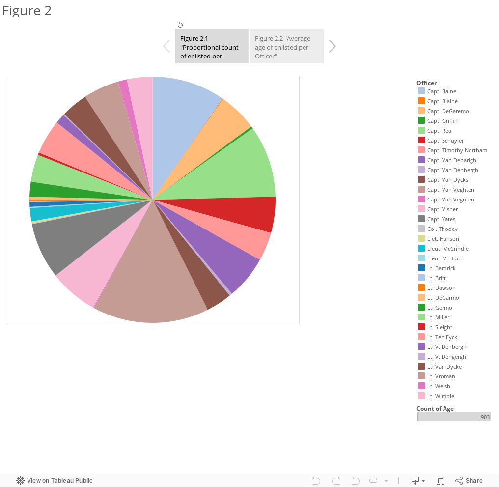
Figure 2 switches the focus from the ages of the enlisted men compared to their place of origin to their commanding officers. As in Figure 1.1, Figure 2.1 shows the total count of the enlisted men under the total number of commanding officers. At first glance, it is clear that Captain Van Veghten is listed as having the most men under him with 138 men. Following closely behind Van Veghten was Captain Baine, with a listed 87 men.
It is difficult to guess why Captain Van Veghten might have more men under his command than the others. One could maybe guess that the other commanding officers controlled men from other militias and that those men made up the number difference. Unlike with Figure 1.1, a lack of numbers cannot be otherwise explained by looking at the other areas of the chart.
Figure 2.2 focuses on the average ages of the enlisted men under each commanding officer. The averages seem to stay relatively equal across all commanding officers, despite the huge disparity between numbers of enlisted men under each officers’ watch. This would imply that there was an attempt to keep an even age range between all commanding officers, which perhaps makes sense considering that keeping all young enlisted men and all of the much older enlisted men separate might be bad for the militia. Figure 2.2 suffers from the same short-comings as Figure 1.2, however, in that the visualized range is still a little misleading. For example, Lt. Britt, located at the top left of Figure 2.2, has an average age range of 36 years old, but if one consults Figure 2.1 they will see that there is only one enlisted man under Lt. Britt. Similarly, Liet. Hanson, who is listed as having one of the highest age averages under his command, is only listed as having 2 of the enlisted men.
Much of the thought process that had gone into creating Figure 1 had also gone into Figure 2. I had intended to use Gephi to show the correlation, if any, between age ranges and commanding officers. I quickly found Gephi to be unhelpful in trying to demonstrate these relationships, however. This is because the number of commanding officers listed on the census is fewer than the number of listed places of origin. Trying to show clusters with such a relatively small list of attributes would have made things seem cluttered, even if I had figured out how to use Gephi to my liking. Because of difficulty with Gephi as a program, I once again chose to use Tableau Public.
It is because of the relative few amount of commanding officers that I chose to use a pie chart rather than a packed bubble graph to demonstrate the proportional count of enlisted men per commanding officer. Because of the limited amount of attribute options, I thought that it would be more pleasing to the eye and less confusing to see the count of enlisted men split by way of pie chart. Since the whole of the chart represents an odd number, the chart is only meant to give viewers a sense of ratio comparison. Once more I used varying colors rather than labels so that viewers would have an easier time differentiating values at first glance. For both Figures 1.1 and 1.2 I used the metric “count of age” to count the amount of enlisted men per comparing attribute. This is partly because I was using that attribute anyway, and partly because it would give Tableau Public something easy and unambiguous to work with. In short, the “count” refers to the amount of individual numbers listed in the “age” section of the dataset, not the value of the numbers themselves.
I chose to go back to using the packed bubble graph for Figure 2.2 because once again I wanted a relatively quick comparison look between the different commanding officers. Because the averages seemed to be so close in range to one another, I thought that using this method rather than the scrolling bar graph would make the differences in size a little more obvious. Unlike with Figure 1.1, I chose not to add color to differentiate the circles and instead chose to include labels. This is, again, due in part to the fewer different attributes I had to work with. I also thought that it gave this section a clean look.
Once again, I ran into the problem of having to delete cells that resulted in “null” commanding officers or ages. It was especially important that I did so in Figure 2 because the amount of enlisted men missing commanding officers to missing ages or places of origins was much higher. A total of 27 enlisted men had to be excluded from the final graph so as not to confuse the viewer. Potentially misspelled names was also a problem with this dataset, although unlike with Figure 1’s place names it was much less easy using OpenRefine to clean the names up. This is because it is more difficult to guess if there weren’t two different men with very similar last names both working as officers in the Albany 8th Militia. Because of this, many similar names appear in the charts and graphs together, such as “Capt. Blaine” and “Capt. Baine,” as well as “Capt. Van Veghten” and “Capt. Van Vegnten.”
Argumentation
Figure 1 shows the ratios between the age of the enlisted men and their listed places of birth. Figure 1.1, at first glance, implies that an overwhelming amount of men who enlisted in the Albany 8th Militia were born in either Ireland or Germany. Since the Albany 8th Militia was made of men who at the time were residing in the Albany area, it is reasonable to assume that Ireland and Germany happened to have a relatively huge influx of immigrants coming to the United States around the time of the Revolutionary War. This is not historically inaccurate. German immigration to the United States was very high in the early 1700s, and by the end of the Revolutionary War there were over 80,000 German immigrants in the United States (Bankston III 2016). Similarly, large waves of immigrants from Ireland were also entering into the United States in the mid to late 1700s (“Irish Immigrants: Early Irish Immigration” 2016). The high level of immigration up to and during the years of the Revolutionary War can therefore be reasonably used as an explanation for the high numbers of Irish and German-born enlisted men.
However, as noted previously, many of the other listed places of birth in the census are of states, cities, and regions in modern-United States. When added together, one can assume that the number of enlisted men born within the United States border can be comparable to those born outside the border. It raises the question of why, then, the census taker would write down specific cities or states rather than simply put down “United States”. Or, one could wonder, why the census takers didn’t go into detail listing specific cities and regions in Ireland or Germany. I propose that the difference in birthplace specification has to do both with the United States’ rapid shift in political and cultural identity, as well as the irrelevance of immigrant origins.
To be clear, by “irrelevance of immigrant origins” I do not mean to imply that the culture or ethnic ties of 18th century immigrants do not matter or are not important in creating a personal identity. However, from 1775 to 1783 the United States of America were shifting from being 13 colonies under British rule to officially becoming their own ruling body. In a world-wide context, most men fighting in the Albany militia, immigrant or not, would have been doing so to help establish the United States as an independent nation. Having an identity beyond simply “Irish-American” or “German-American” could arguably have been seen as an oddity or an insult. Therefore, it is possible that census takers could have purposefully left out specific towns or regions from outside the colonies in order to help assimilate immigrants into their enlisted ranks. Other countries, such as Guinea, Holland, and even England have similarly simplified labels that could potentially support this.
This explanation decreases in likelihood, however, when one sees that there is a place in Ireland specified in the census, designated “Kilmore in Irel’d.” Though only one of the enlisted seem to be from this location, it is possibly fair to say that the idea of forgetting one’s foreign identity to adopt a local United States one is a little too romantic. When one views the manner in which the different census takers seemed to take down information and the many typos that seemed to come in the original transcription, it appears more probable that most non-United States based placed of birth simply weren’t deemed important enough to distinguish between.
As to why the locations within the United States are differentiated, one can probably attribute this entirely to the fact that the United States was still just a collection of colonies. These colonies were certainly united under a common goal, i.e., revolting against British rule, but it is well known that directly after the Revolutionary War the newly formed states had vastly different community identities and opinions on the new governing body. The census takers might have differentiated the places of birth within the United States because places such as Ireland, Germany, and England were old enough nations to have a baseline, unifying identity, whereas the United States did not. In other words, it might have been the case that an enlisting man stating that he was “Irish” was enough for the census taker to get an idea of that man’s identity, whereas a man born in the United States could not yet claim, or perhaps did not yet want to claim, that he was from the “United States.”
This reasoning could explain the age range disparity in Figure 1.2 as well. The places of birth with very general labels, such as “Ireland,” have a large number of people identifying as originating from there, so the average age of Ireland seems more reasonable at 31. Very specific places such as Martha’s Vineyard, on the other hand, have extremely high documented average ages because there is only one enlisted man documented to have come from there, so the average is obviously biased.
Figure 2 tells a more ambiguous story on its own, but ties age, place of birth, and commanding officer correlation together. When I began this data visualization project I had been interested in seeing if there had been a nationalistic or ethnic separation of enlisted men based on commanding officers. With such a seemingly disproportionately large amount of enlisted men being from Ireland and Germany, I had assumed that any visualizations I might get comparing place of birth and commanding officer would be highly skewed, so I shifted my data visualization to focus on age rather than place of birth. In doing so, however, I unintentionally cleared up some of the confusion.
It is clear in Figure 2.1 that some of the commanding officers had many more men from the Albany 8th Militia under them than others. Capt. Van Veghten, for example, is shown as having 138 men under his command, whereas Lieut. V. Duch is shown to only have one. Because the highest listed shared place of birth is Ireland with 220 documented enlisted men, one might assume that the 138 men under Capt. Van Veghten were all Irish since Capt. Van Veghten also had the highest count in his category. However, one only need to compare Figures 1.2 and 2.2 to see how that assumption would be incorrect.
Figures 1.2 and 2.2 both compare the average age of the enlisted men to another category; specifically place of birth and commanding officer. What is immediately apparent is that there are many more listed places of birth than there are officers. Additionally, the average ages between the places of birth have much, much larger gaps than those between the commanding officers. The average age range between the places of birth is 16 to 46 years old. The average age range between the commanding officers is 20 to 41 ½ years old. This is a nearly 10 year gap difference.
More than that, whereas many of the age averages in places of birth were either around 16 or around the 40s, the age averages under the commanding officers seem to be mostly late 20s and early 30s. This evening of the average ages of enlisted men under commanding officers would not have been possible if all of the Irish men, who had an average age of 31, were only under one officer. One could argue that the fact the average ages under the commanding officers with very few or singular men under them, such as Capt. DeGaremo and Capt. Griffin, are fairly middle ground supports this. Capt. DeGaremo’s average age of enlisted men is listed as being around 32 years old, while Capt. Griffin’s is listed as being around 25 years old.
This all implies that the militia leaders were far more interested in separating the enlisted men by age, to perhaps keep their ranks even, than keeping specific ethnicities or nationalities together. This aligns closely with the assumption that the listed places of birth were both vague and oddly specific as it tied to identity. Because everyone enlisted was fighting toward one common goal, nationalistic identity was both irrelevant and, in the case of the then-13 colonies, difficult to define. Although the trend clearly differed depending on the census taker, militia leaders seemed to unify their ranks and balance age and experience among their soldiers rather than cause nationalistic-based rifts.
Further Research
In the end, all of the above observations are almost pure speculation. There is no way to prove with the limited dataset and context provided to me that foreign-born enlisted men were given vague identifiers because of shifting cultural identity and not because of, for example, xenophobia. I think that these visuals lead to extremely interesting questions, however.
Because I am fascinated with cultural and political identity, I wonder if having access to the other census information from the other divisions of the Albany militia might shed a different light on the subject. If it is true that the militia leaders were more interested in balancing experience and potential skill among their ranks, can one assume that every census would be filled out in a similar manner to that of the 8th militia? Alternatively, is the 8th Albany militia unique in its separation of enlisted men? In order to research that, one would need access to other militia censuses from around New York, as well as potentially all of the original colonies. One would also need the tools and manpower to compare the thousands of enlisted people in the datasets.
If the censuses do result in different average age to place of birth and commanding officer ratios, however, one could argue that the political and social climate of the different colonies could be effecting the various militia leader choices in ways that historians who specialize in Northern history might not realize. Researching that would involve researching primary documents such as diaries and newspapers to try to discern public opinion on national identity, which in itself would be a challenge to not judge through a modern lens.
My data visualizations certainly make me wonder about the other factors that might have contributed to the separation of enlisted men under their commanding officers. Is it reasonable to assume that enlisted men were similarly separated due to their skills and trade prior to enlisting? Did the socio-economic class of the enlisted men have anything to do with which officer they were under, or how old they were upon enlisting? Did marital status play any part in which officer an enlisted man was put under?
It would be fairly easy to discern the relevancy of trade and pre-enlisted skill in placement, since the census dataset lists the occupation of the enlisted men prior to their enlistment. At the very least, I know that a classmate of mine has done her final data visualization on the correlation between ethnicity, trade, and placement. With access to more of the militia censuses, it seems entirely possible that a more completed picture of the relationship between age, trade, and placement under a specific officer could be made. As for the relevance of socio-economic identity to placement and enlistment age, one would no doubt need access to family tree records and, I’d imagine among other things, newspaper clippings and bank records.
This line of questioning might not be worth investigating in the long term based on the sheer amount of difficulty one might have in acquiring the necessary documentation to prove socio-economic status. For more well-known people such as the Schuyler family, this would not be a problem due to the fact that the family is well documented and historically significant. Proving the socio-economic status of an immigrant family would be difficult on its own, considering that modern views of socio-economic status must be very different from 18th century notions of it, but proving the socio-economic status of an immigrant family during a time when United States identity was already fragile seems very nearly impossible. That is not to say that this line of research wouldn’t be valuable in teaching how socio-economic relations in immigrant families, or even colony-born families, influenced war time and militias. The practicality of researching it seems as though it would be daunting and easily susceptible to bias.
I can’t imagine marital status posing as a large hindrance to who enlisted and when. During the 18th century courtship for marriage began as early as 15 or 16 years old, though actual marriage was often postponed until a person’s 20s (Maurer 2016). The entire process was taken very seriously, apparently. It therefore seems reasonable to assume that the men who enlisted while still in their mid-teens might have put off marriage until after the war. There are men listed in the census who were in their twenties or older when they enlisted as well, though their marital status is not listed. If married men seem to be favored by certain commanding officers in consensus, would that be based on pure coincidence or social stigma? It seems unlikely that militia leaders who don’t care about nationality would care about marital status, but I would still be interested in finding out.
It is worth noting, after all of this, that a lack of apparent segregation on the militia leaders’ parts does not directly imply a lack of self-segregation by the soldiers. Though the motivation of the militia leaders can be speculated on according to the data visualizations, there is no context given or implied by the censuses as to what the soldiers themselves might have been thinking. It might be worth looking into to see if there were any points of tension when it came to soldiers of different nationalities and ages forced to work together. In order to research this, one would need access to diaries and letters specifically sent and received during wartime. For further context, one might need to find diaries and letters sent before the Revolutionary War and in the years that followed, to see if perhaps, assuming there had been some sort of stigma among the soldiers, that stigma had changed in any way.
Bibliography
Bankston III, Carl L. 2016. “History of Immigration, 1620-1783.” Immigration to the United States. Accessed May 10. http://immigrationtounitedstates.org/548-history-of-immigration-1620-1783.html.
“Irish Immigrants: Early Irish Immigration.” 2016. Immigration to the United States. Accessed May 11. http://immigrationtounitedstates.org/632-irish-immigrants-early-irish-immigration.html.
Maurer, Elizabeth. 2016. “Courtship and Marriage in the Eighteenth Century : The Colonial Williamsburg Official History & Citizenship Site.” Accessed May 11. http://www.history.org/history/teaching/enewsletter/volume7/mar09/courtship.cfm